Created by Senanur Kök
🧠 Tip: Aggregate your data (e.g., daily → weekly) and use ci bands to make trends clearer.
This OrgPad document is structured as a hierarchical visual guide for data visualization using Seaborn (a Python library built on Matplotlib).
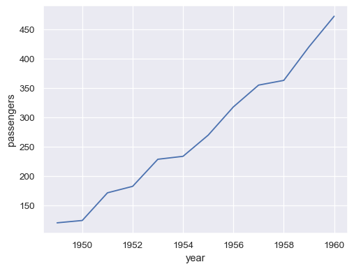
basic line chart for trends
import seaborn as sns
import matplotlib.pyplot as plt
sns.set_style('whitegrid')
sns.lineplot(x="year", y="passengers", data=df)
plt.show()
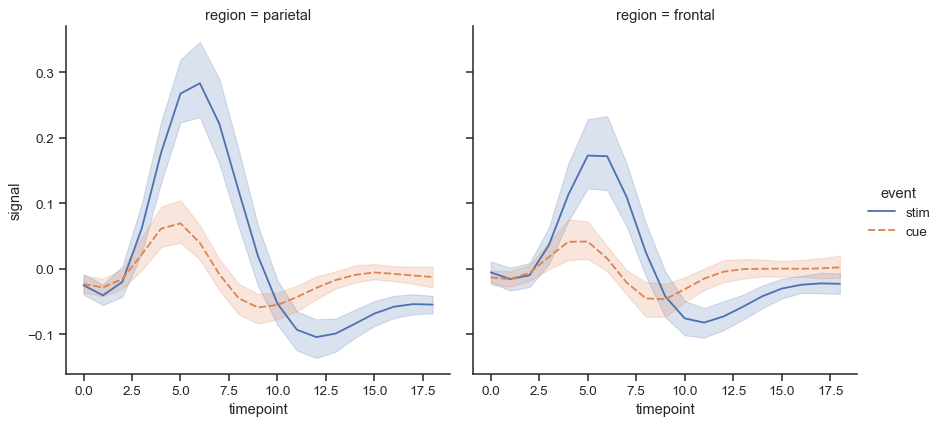
top-level function supporting faceting (col, row) and hue.
sns.relplot(data=fmri, x="timepoint", y="signal", col="region",hue="event", style="event", kind="line",)
(Explore relationships between variables)
🧠 Practical tips: if dataset is dense, use transparency (alpha) or downsample; for categorical hues with many levels, consider grouping.
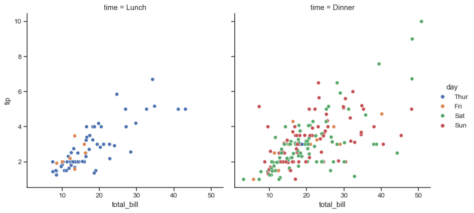
high-level scatter function with faceting.
sns.relplot(x='total_bill', y='tip', hue='day', col='time', kind='scatter', data=df)
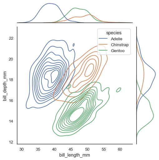
scatter + marginal distributions.
sns.jointplot(data=df, x="bill_length_mm", y="bill_depth_mm", hue="species", kind="kde")
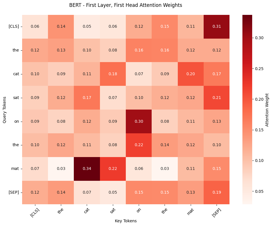
visualize matrices (e.g., correlation matrix or confusion matrix).
sns.heatmap(attention_weights,
xticklabels=tokens,
yticklabels=tokens,
cmap="Reds",
annot=True,
fmt=".2f",
cbar_kws={'label': 'Attention Weight'})
(Show distribution and spread of a single variable)
🧠 Practical tips: overlay KDE+hist for clarity; use log_scale=True if data has heavy tails; boxplot is great for comparing spreads across categories.
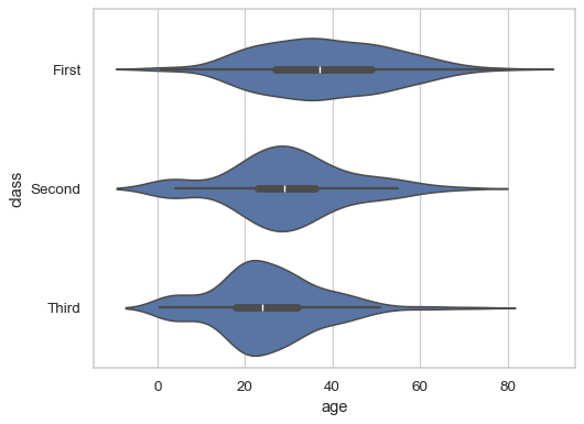
combines boxplot with density (useful for multimodal distributions).
sns.violinplot(data=df, x="age", y="class")
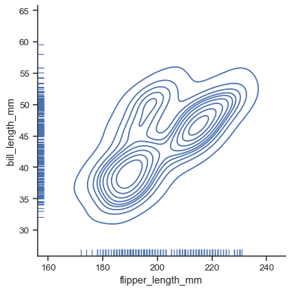
high-level distribution plot (supports kind='hist', 'kde', 'ecdf').
g = sns.displot(data=penguins, x="flipper_length_mm", y="bill_length_mm", kind="kde", rug=True)
smooth density estimate.
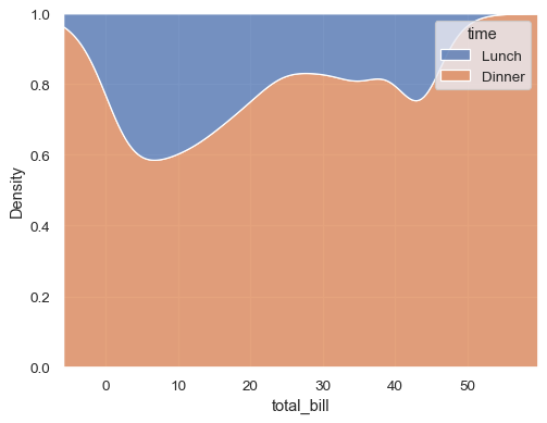
sns.kdeplot(data=df, x="total_bill", hue="time", multiple="fill")
Seaborn does not have a native ‘stacked bar’—use pandas or matplotlib for stacked charts:
grouped = df.groupby(['month','category']).size().unstack(fill_value=0)
grouped.plot(kind='bar', stacked=True)
(Show parts of a whole)
🧠 Practical tips: annotate percentages directly on bars; consider a pie chart only for few (<5) categories.
(Compare groups or categories)
🧠 Practical tips: for skewed data use median (via estimator=np.median); rotate x-tick labels for many categories.
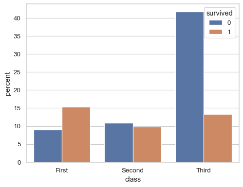
simple counts for categories.
sns.countplot(titanic, x="class", hue="survived", stat="percent")
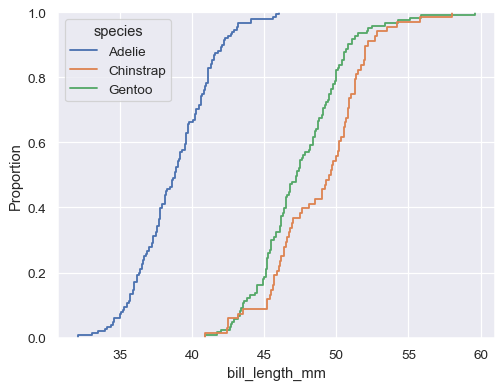
empirical cumulative distribution.
sns.ecdfplot(data=df, x="bill_length_mm", hue="species")
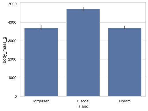
shows estimate (by default mean) with CI.
sns.barplot(penguins, x="island", y="body_mass_g")
can be used to show grouped bars (not stacked) for composition-like views.
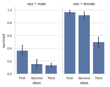
sns.catplot(
data=df, x="class", y="survived", col="sex",
kind="bar", height=4, aspect=.6,
)
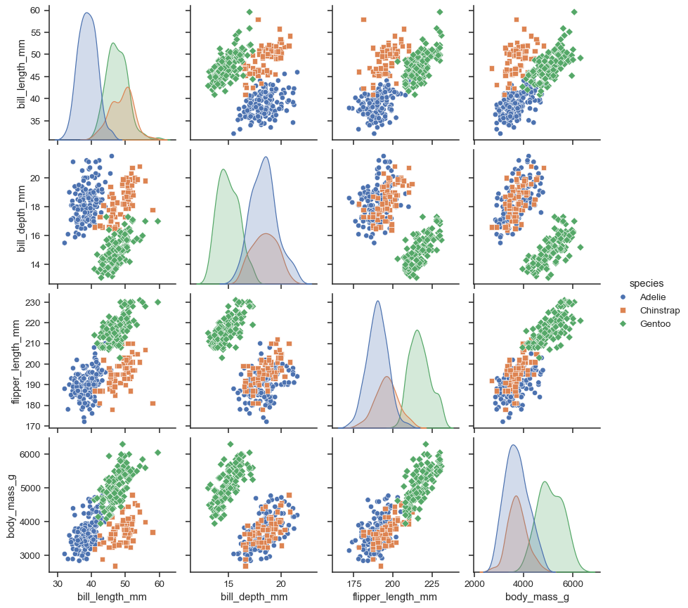
(Many variables together)
🧠 Practical tips: limit to 4–6 variables for readability; consider using corner=True to show only lower triangle.
pairwise relationships and marginal distributions.
sns.pairplot(penguins, hue="species", markers=["o", "s", "D"])
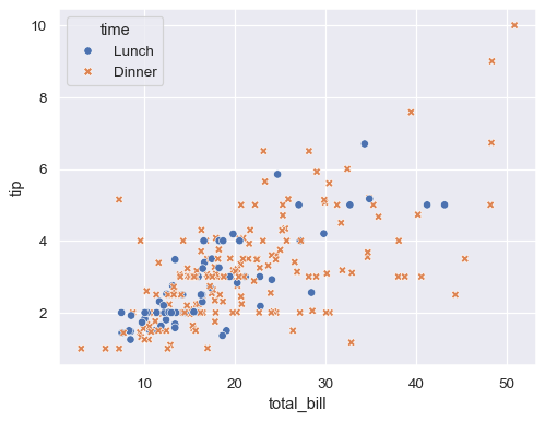
scatter plot for two numeric variables.
x="total_bill",
y="tip",
hue="time",
style="time",
data=df
)
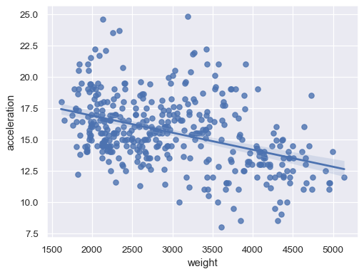
scatter + regression line (simple use).
sns.regplot( x="weight", y="acceleration", data=df)
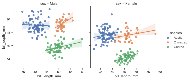
combines regplot with faceting and hue.
sns.lmplot(
data=df, x="bill_length_mm", y="bill_depth_mm",
hue="species", col="sex", height=4,
)
general categorical grid function.
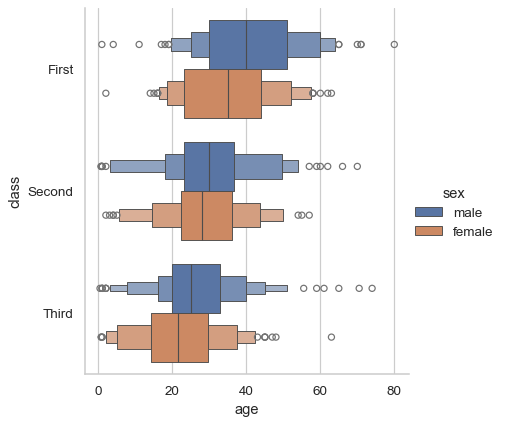
sns.catplot(data=df, x="age", y="class", hue="sex", kind="boxen")
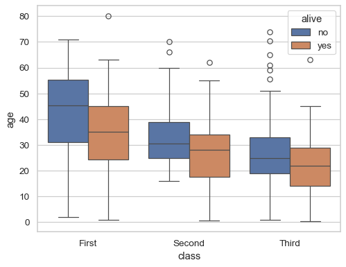
compact summary (median, quartiles, whiskers, outliers).
sns.boxplot(data=titanic, x="class", y="age", hue="alive")
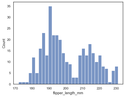
histogram with optional KDE overlay.
sns.histplot(data=penguins, x="flipper_length_mm", bins=30)
Image source: Seaborn Documentation (https://seaborn.pydata.org)
Kaggle Data Visualization Course (https://www.kaggle.com/learn/data-visualization)